As I go about my business on the web, I visit websites that are in desperate need of a redesign. This usually happens every day, but I am also a 3D Printer. A website that I use very often is called Thingiverse. It is the most popular place on the internet to get 3D files to print. Sadly, this website has a lot of issues, and they aren’t just limited to design issues. Everywhere you go in the 3D printing community you’ll find people that will complain about how awful their website is. What makes this even more egregious is they just went through a redesign about a year ago. It solved none of the problems. Through this multi-part series I will go through exactly what is wrong with the website from a design perspective and then redesign it into a website that users will be easily be able to use. Here we go.
The Analysis
Before we go through and redesign the website, we need to look at the current page and determine what is working and what is not working.
Let's look at the home page.
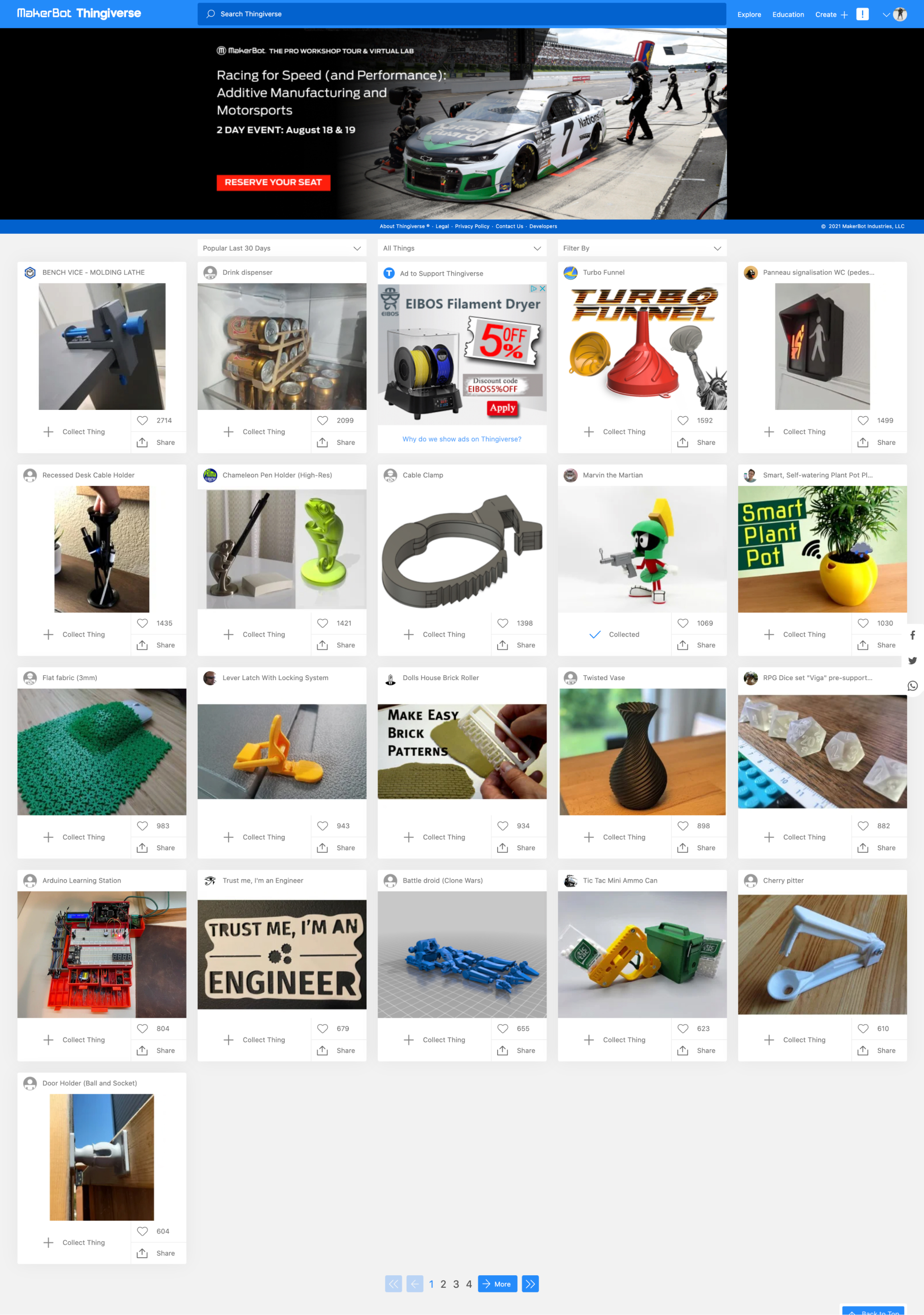
What's working
Let's talk about what is working first.
The header is actually pretty strong.
Easy to find search
Navigation that has enough contrast.
Lots of popular files at a glance
Simple colors
Adaptive layout. It's not responsive, but it's better than nothing.
What's not working
Confusing navigation item(s)
Hero content is lackluster
Copyright and Footer links are in the header?
Filters get lost
Search doesn't work as intended
Images for the cards are sometimes not the same size as the others which makes them appear messy.
Card content isn't optimized.
Ads look identical to normal content
Social icons are haphazardly placed on the side. They are visually hard to see and can overlap content.
Pagination has too many styles making it appear busy and hard to use.
Overview of the issues
Let's break down the issues to better understand them.
The Header

Just this in and of itself needs to be broken down but the main purpose of pointing out the header is that this doesn't seem like it is a marketplace for 3d files. There is little to indicate that. We will go over that a little more as we talk about the header in a minute.
Strange Navigation

I am logged in to show you one pretty weird item. If you look there is an exclamation mark. At first glance, I thought this was a warning or some form of notifications. When I clicked on it I was shocked about where it took me. Can you guess?
Did you guess the user's dashboard? I bet you didn't. The icon makes no sense. That is a huge UX issue. I almost never go to my dashboard because I am never reminded about it.
Even the design before this "redesign" was more clear in it's navigation.

The Hero

I get that the hero relates to the business (very loosely), but the general visitor doesn't really care about this. Their main purpose of visiting this page is to find and download files to print on their printer or upload their own file for others. Not to mention that the day I write this is well after the date it was supposed to take place. So even if it was super relevant in the subject, it would be too late for anyone to take advantage of it.
The Footer?

Sorry that image is a little hard to see. It was necessary to show how... weird it is. One part is centered and the other is right-aligned. Nothing on the left. Confusing design decision.
I guess they thought including the footer in the header was a good idea. I think this might be a design holdover from the last design where the page would continuously load cards as the user scrolled making it impossible to see a footer in a traditional design. Even if my guess was true there are many ways to solve this that don't take up invaluable real estate with information that is rarely ever used.
Filters

This one really confuses me. The filters get totally lost and even have a similar layout and look to the cards which only help it blend in. They are usable if you find them. There are many ways to make the filters more visually noticeable and useful without hiding them.
Cards
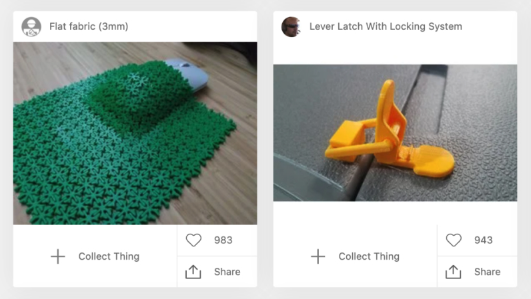
You can see from this screenshot snippet that the images are not the same size. Again this might be a design holdover from the last design, but that is no excuse. The designer needs to handle that in a more elegant way. The actions you can take on the card are also confusing. Is collecting the "Thing" the most useful action here? It might be, but why not download? That seems much more useful. Also, how often are people sharing these? One other comment. The "Like" concept. Having used the site for a while, I see very little difference between collecting something and liking something other than collected items can be organized into groups. Perhaps the likes show how popular an item is? Wouldn't a metric on collecting be much more useful? I am not convinced both are needed.
I also want to point out that the ads that are on the page look almost identical to the actual content the user really wants. This isn't good and can breed a sense of distrust.
What do users think?
Now that we have determined what I think is wrong with the site we need to understand where the pain points are for users. I sent out a survey asking these questions to the community. Let's go over what I found.
What they liked
By far the most liked thing about Thingiverse is that it has a lot of files for them to find.
That's it sadly.
What they didn't like
Funny enough there is also not a lot to talk about here as well. There were 2 stands outs in the responses.
Search Engine
The most painful part about using Thingiverse for users is the search engine. Many complained about the difficulty of searching for things they want. While this is more of a programming thing outside the scope of this exploration, we can certainly take some of the stings out of design by incorporating some better search tools. Users even noticed that search on mobile is just downright broken often returning "null" values. This is a very bad experience, to say the least.
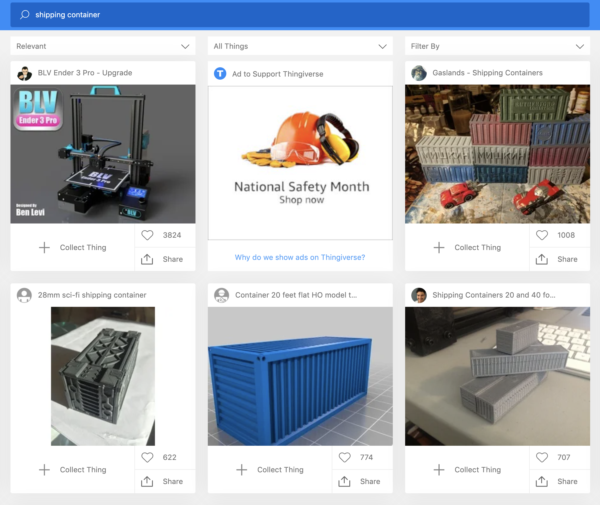
Users also reported no results on misspelled items. If you search for "shiping container" you will be greeted with this screen

If you spell it correctly, you get 7 pages worth of results or about 140ish items.
General UX issues
Another issue that people complain about I am going to group together. They are using the back button after viewing an item returns them to the start of the item list instead of where they left off. I have gotten around that by opening up "things" in a new tab. Users should not be forced to find workarounds just to use the site.
The other one is regarding the login page. The "remember me" function either doesn't remember you longer than 5 minutes or more likely is downright broken. Another issue related to this is the redirects after login. If you are on a "thing" and log in so you can add it to your collection, it will redirect you to the homepage. Not ideal.
Again, this is more of a programming issue rather than a design issue. But a pain point is a pain point that the company needs to look at.
Other pain points
There were some other points that people brought up. In no particular order here are a few.
Load times
Terrible UI
Unusable mobile view
Difficult navigation
General thoughts about design and usability.
For informational purposes here are the values on what people thoughts about the design and ease of use of Thingiverse.
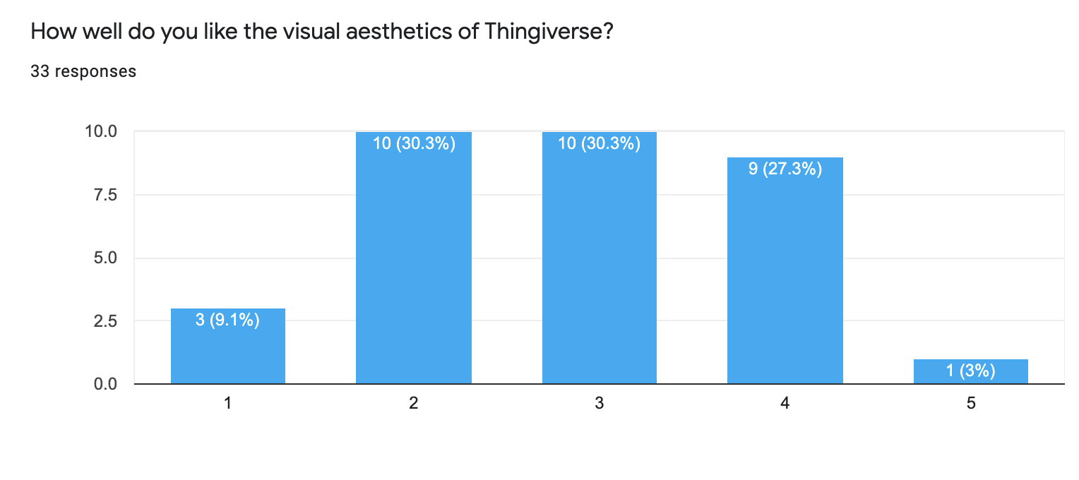
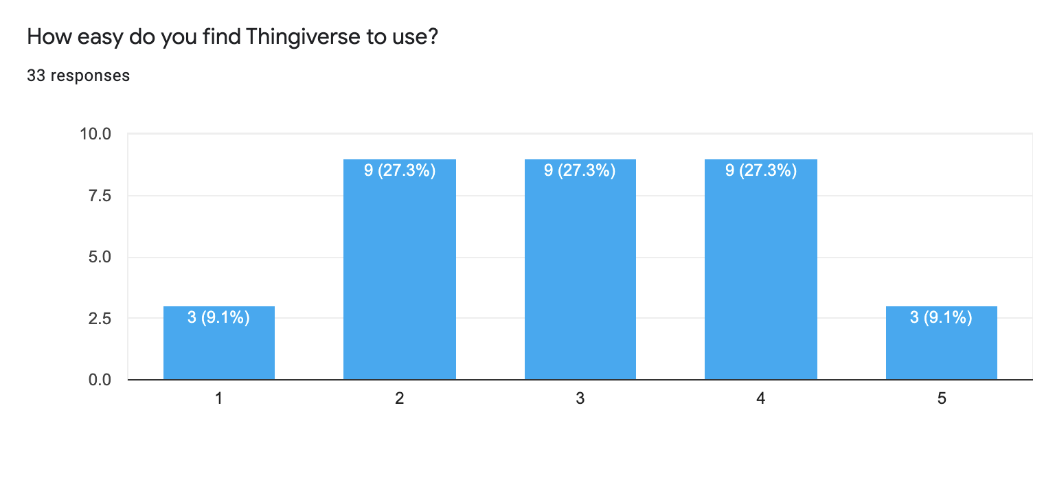
I was a little shocked at how middle-of-the-road users thought about the design and usability.
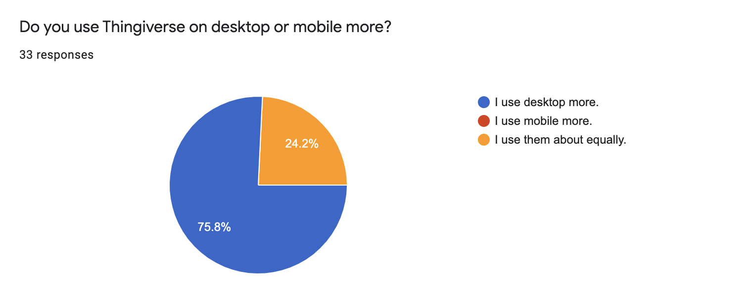
And last how people used it. It is no wonder why no one uses mobile more than desktop when you take into account that search is basically broken on it.
Getting started on the design
We have all the tools we need to get started on the redesign. We know what we must fix, what to focus on, and what we need to do. The first order of business is to sketch out some wireframes on paper and come up with more professional ones on the computer.
Until then.