There is no denying that there is sometimes a huge gap between designers and developers. Both professions require a certain mindset to look at problems and solutions in different ways. This can often lead to disconnect when the two need to work together. I am in a unique position that I have experience as both a designer and a front-end developer.
In this article, I will be going over some things that a designer can do to make the process easier for the developer to code out the designer’s vision.
Communication
The very first thing both practices need to do is communicate. In both worlds, there are unique terms that both need to be aware of so they are speaking the same language, or at least know what the other one is talking about.
Just in typography, the same thing can have different names. For example, designers use the term tracking to describe the spacing between a group of letters. Developers call this same thing letter spacing.
Another thing to watch out for is that type is handled much differently on the web than it is with design software. The basic difference is that some design software prefers to do font sizes in points (pt). While with coding you can define points, you would be hard-pressed to find a developer who actually uses it. There are many more ways to define font size on the web that is much better suited for the screen. Points are better suited for print mediums because it is defined as 1/72 of an inch. An inch can mean different things on a screen depending on screen resolution and page zoom. Developers often use pixels, rem, em, and many more depending on the situation. Bowsers even have different ways of rendering text on the screen. In short, we do have controls to make type look good on screen, but especially on older browsers, we are sometimes at the mercy of how those browsers render type. Developers can communicate that, but in reality, no design is going to be translated 1 to 1 to the web so the designer needs to expect that.
Designers and developers need to constantly talk throughout not only the developing process but the design process as well. Designers need to make sure that their design is being developed the way it was intended and developers need to make sure that the design that is being produced can actually be done or can be done in a way that doesn’t slow down a site. A bad designer might try to use 6 different fonts because it “looks good”, but a developer should tell him that loading those fonts would cause a negative impact on performance.
There have also been many times that I have gotten a design that just simply wasn’t able to be produced in a coding environment. Both need to be in constant communication to reduce the redoing of work. A developer should never get a design he has never seen that has already been approved by the client. This is a really good way to look unprofessional by having to go back to your client to approve a design a second time because the developer has issues with it.
Consistent Colors
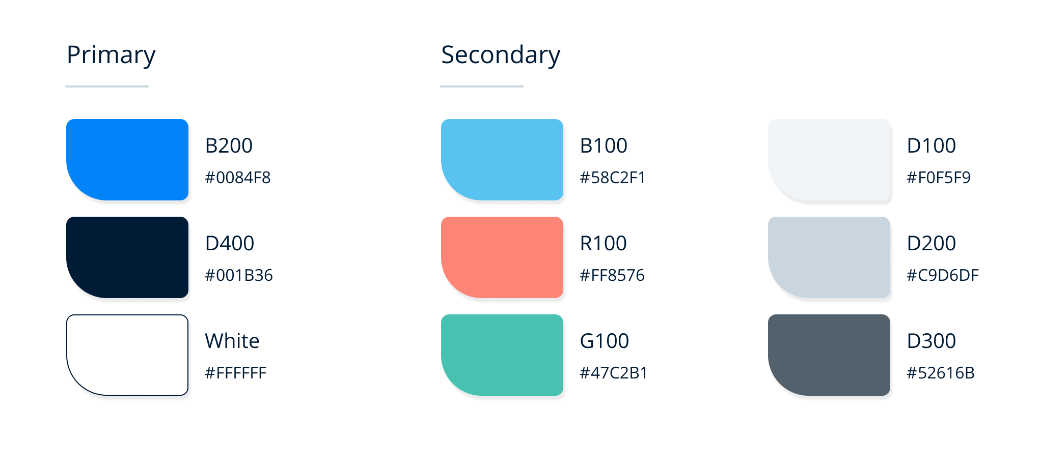
Colors are one of the most important aspects of a design. It can convey emotion, direct or attract attention, group elements, or enhance the aesthetics of your site. That is why it is so important to define exactly what your colors are and make sure you are using them consistently. If your normal paragraphs are at #444 on one page, make sure they are #444 on every page. Having them slightly different will confuse the developer and make it harder for him to effectively do his job.
Look at the following image. We can see two different blocks of text. At first glance, they look like the same color but if you look at the color guide on the bottom you can see that they are indeed different colors that are very close to each other. Designers need to be very careful that this doesn't happen in their designs. The best thing to do is to set up a color style (or whatever the program you are using calls saved color values).
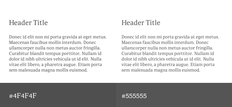
The best course of action is to create a color guide that the designer and developer can both use to set and use colors.
Consistent Spacing
Inconsistent spacing is likely the biggest issue that I see from designer files. It is also the hardest to keep consistent so it is understandable. This is where communication is also key. Designers usually set spacing requirements between objects and under the typographical text. Setting specifications that the developer can see can better translate to what spacing should be, and not what it actually shows on the design file. If a designer says that all space under an H2 element should be 16px, the developer can account for that instead of changing it to 14 because something is visibly inconsistent in the design.
Consistent Components
Developers have a phrase called DRY. It stands for "Don't Repeat Yourself". As you develop components it makes sure that you are reusing previously written code and makes maintenance and bug finding easier. Designers can do the same with their files. You can make components that are reusable. The nice thing about this is that if you need to make a change to it, it will filter down and change all instances.
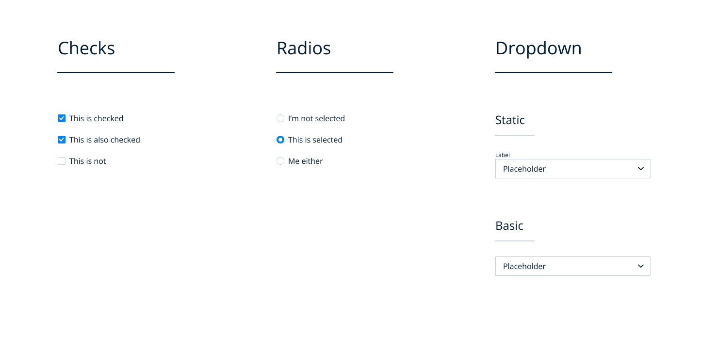
If you are providing different designs for the same component (like a drop-down) because it visually looks better on a different page, then you must ask yourself if changing to a different look from the rest of the site is really needed for the user, or if it is satisfying your own creative needs.
Plan for Different Viewport Sizes.
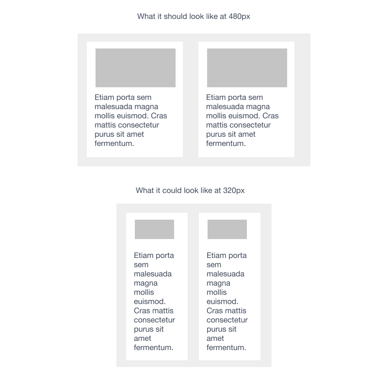
Make sure the design has enough space for different sized content like different amounts of text, long names, lack of content, etc. Also, make sure that there is enough space for content to breathe at small viewport sizes. If you are giving a design to a developer that accounts for 480px wide, try to imagine what that same design will look like at 320px.
Provide States and Animation
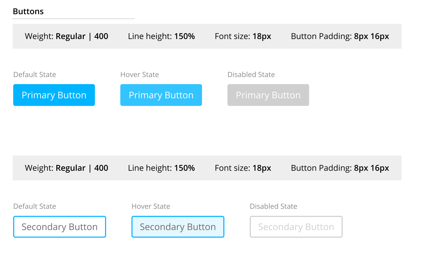
One of the easiest things for a designer to do is to provide states for elements. States like buttons and hyperlink hover, disabled, and active states are often forgotten by the designer as they are typically more concerned about layout, colors, and content. But states and animations should be considered part of the core UX experience. It should also be considered part of the accessibility experience.
This also applies to anything that can have different states that aren’t normally part of the interactive elements like buttons.
Animation is exactly the same. You don't necessarily need to create the animation yourself, but either communicate what the animation should be or provide documentation on what it should look like.
Use a Design System
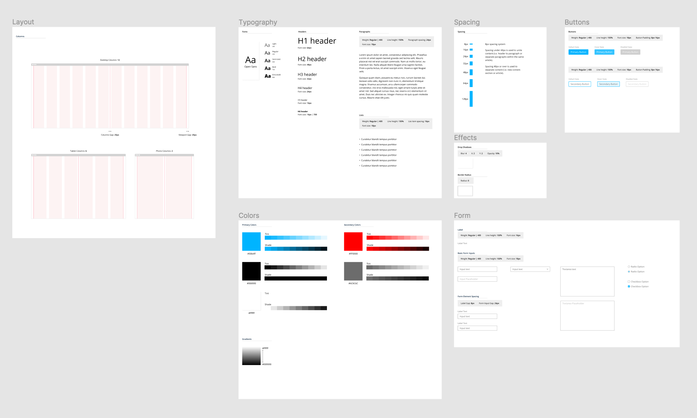
All of the things we have talked about thus far can be solved with one simple solution. A Design System. If you haven't already go and read my other articles on design systems with part 3 coming soon. Part 1 is an Introduction with Part 2 on Design Principles.
The goal at least when pertaining to this article is to create a component library of elements that you can use to create your design. This helps the developer because he knows exactly what to expect in terms of what he is supposed to style.
Be Prepared for Changes and Requests
Throughout all the communication between the designer and developer, there can and likely will be some changes and requests. These should not be viewed as an attack on the design or the designer. Everyone should be working on the same team and team members have different perspectives and ways to tackle the same problem. Each solution should be weighed carefully and thoughtfully.
Wrapping Up
The best thing to do in all cases is to work together. When you work as a team, many things are possible and the outcome is usually the best one. Do not have a mentality of "them vs us". That creates division and everything will suffer because of it.
Do your best to come together to solve issues. Ask what the developer needs to complete his job. Ask if what you designed can be improved upon. Sometimes a developer might have a better idea of how to design something that could increase the performance of the application or be easier for the users to use.
You just never know unless you work closely together.