It is without question that mobile is generally the preferred way that the majority of people, particularly in the US, experience the web. So it should make sense that you would code from a perspective that is mobile first. But with all it's champions and touted benefits, it is necessary if you code mobile first, or desktop first? Let's explore.
I do want to make something clear. This article is strictly speaking about mobile first code, not mobile first design. I think focusing on the design of mobile users has great benefits that one should not overlook. I will be focusing on the practice of writing CSS from a mobile first base and then using media queries to scale up the design.
Is mobile first code necessary?
Short answer: No, but you probably should anyway.
Debunking Myths
A lot of the same benefits are mentioned when talking about why you should code mobile first. I will go over a lot of them and also debunk them or in the very least provide more context as to why they are or aren't as important as people make them out to be.
1. Focus on core content
They say 'content is king' and I certainly agree with that. It is confusing as to why people will mention that your website should focus on content when talking about mobile first code. In general, this is a design issue, not a coding issue. They are either confusing mobile first design vs code, or combining two related but separate mindsets when building websites.
Regardless of if you code with desktop first or mobile first, the design for mobile should have already been done and this should have already been solved.
2. Decreases load time
This myth is that your code will render faster on mobile (something very important) if your base CSS is written for mobile. The truth is, is that the performance gains are so negligible that it it's really perceivable to the end user.
If you think about it, your CSS should be combined into a single stylesheet that will end up getting cached. Your CSS has to be read fully by the browser to even start painting the website. The entire CSS document has to be downloaded in full no matter if you code mobile or desktop first. So where are the performance gains from? It's from the browsers necessity to parse code in media queries. If you code from a desktop first perspective, mobile browsers are going to have to parse what is in your media queries before it's first paint. So it does take extra small time to do this.
But in reality, devices are super quick and can do this at mind boggling speed. So the performance gain that is there, doesn't really matter in the long term. You will be much better optimizing your images for better gains than worrying about this.
3. Reduce image load times with smaller images
So to understand this one, it requires that one must understand the different ways one can load images into a site. The two main way is background images via CSS and inline images via the HTML image tag (<img>). We will look at both of these and debunk why again, it doesn't matter if you do mobile or desktop first so long as you do it correctly.
Background Images
Typically you don't want to load images that are 1000px wide on a screen that is 480px wide. The images are just too large to have the user download an image that is larger than needed. Optimization is in order if you do. This is where everyone says to download the smaller image first, which is smaller in size of course. You don't want the user downloading two images if all you really need is the smaller one. Let's see what is happening behind the scenes.
Let's use CodePen and write some desktop first code.
div {
  height: 1000px;
  width: 1000px;
  background: url('http://placehold.it/2000x2000') no-repeat;

  @media (max-width: 800px) {
    background: url('http://placehold.it/400x400') no-repeat;
  }
}
Here we are using a service to load in a desktop image first and then if the viewport gets smaller than 800px, then it will load in the mobile image. If you believe what everyone says, it will request the 2000px image first and then the 400px image. This would be bad since mobile users wouldn't need or even use that larger image. But let's see what the browser is actually doing via the Network tab on Chrome Dev Tools.
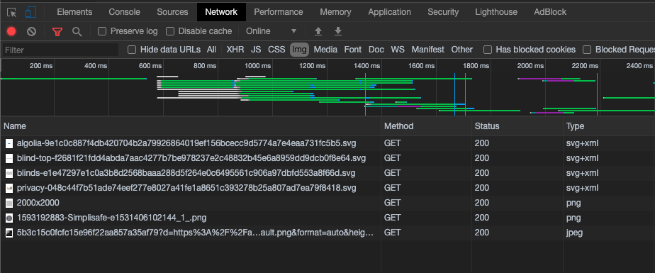
When viewing it on a desktop size, this is what is requested:

As we can see here, it successfully requests the 2000x2000 image. So one would expect that if you load it on mobile, it would request the desktop image first, and then the mobile image. Let's see if that is what actually happens.

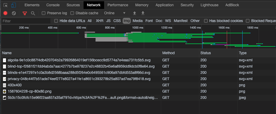
If you look, the browser only requested the mobile image, and not the desktop image. The browser is smart enough to know which one it needs and request the one that is needed. So as long as you make images optimized for both desktop and mobile, then it really doesn't matter if it is coded mobile first or desktop first. Browsers are kinda smart.
Inline Images
Inline images use to be the same way. You produce a larger image that will scale and shrink to mobile size often leading to an image being 1000px wide but being displayed at 480px.
Today there is a much better way to handle this. Using the <picture> element you can define when certain pictures will show.
Let's look at an example.
<picture>
  <source srcset="https://placehold.it/2000x2000" media="(min-width: 800px)">
  <img src="https://placehold.it/400x400" alt="">
</picture>
The browser treats this in the same way as background images, only requesting the image that needs to be displayed.
So here we see that regardless of if you code desktop first or mobile first, as long as you do your images correctly, it really doesn't matter which one. The browser will do the right thing and only serve up what it needs.
4. Simplify your code
This one is likely the only one that holds any truth.
Since most of the elements you are going to be using will be block level (for layout), they will be displayed vertically which is better for mobile. In this case it absolutely makes sense to take the mobile first approach if code simplicity is your goal.
Let's look at an example of a desktop approach with a mobile adjustment.
.container {
  display: flex;

  .icon {
    width: 24px;
    flex-shrink: 0;
    margin-right: 16px;
  }

  .text {
    flex: 1;
  }

  @media (max-width: 800px) {
    flex-direction: column;

    .icon {
      width: auto;
      margin: 0 0 16px;
    }
  }
}
Nothing too bad. Just some simple text with an icon to the left.
Now let's look at a mobile first approach
.container {
  .icon {
    margin-bottom: 16px;
  }

  @media (min-width: 800px) {
    display: flex;

    .icon {
      width: 24px;
      flex-shrink: 0;
      margin: 0 16px 0 0;
    }

    .text {
      flex: 1;
    }
  }
}
This code is much simpler and does the exact same thing. It makes sense to do this. If you wish to do a desktop first approach, your code may be longer, but in the end it comes down to personal preference. Your site isn't going to die on performance based one approach over the other
Conclusion
So is a mobile first approach to code an absolute necessity? Not in the least. All of the advantages of doing it you will be hard to measure if you code correctly. That being said, we are constantly turning into a mobile first society to how we consume content. We need to think of our designs in this fashion and we should probably think about our code in the same.
Just for now, it doesn't matter if you don't. But do it anyway for good practice.