A big trend in web and application design right now is dark mode. A great dark mode can make or break an experience. In this article we are going to go over how to make an effective dark mode and what mistakes to avoid that even the large players in the field make.
Why Dark Mode?
If you are reading this article then you likely already know why you want to use a dark mode. But in the event that you don't know what advantages a dark mode can offer we will go over some.
For Your Health
For starters dark mode can be much easier on the eyes, especially in low light situations. Let's face it, if you are in a dark room, you don't want to be blinded trying to see something on your phone or tablet. It can also cause dryness in your eyes from staring at bright screens all the time. You ever notice why most car dash lights are blue? It's because it is designed to keep you awake. It can have the same effect if you view light mode apps and web pages before going to bed.
For Your Battery
It take power to light up all the little pixels on your screen. You can preserve your battery by using dark mode which doesn't take as much power. Using an OLED screen using dark mode you can save as much as 60% of screen energy. Those are huge savings.
For Your Mouth
I'm going to be truthful, dark modes just look mouth watering good. That is... the really good ones. It is still totally possible to mess up a dark mode.
Avoid Pure Black
This is dark mode, not black mode. It might seem easy to just set your background as pure black (#000000) and call it a day, but in reality pure black usually causes too much contrast with whatever is in front of it. This causes just as much eye strain as a light mode.
Dark gray surfaces are much easier to look at and might even want to slip a little cool blue in it if the branding allows it. For example you can start off with a base color such as #202123.

Avoid Pure White
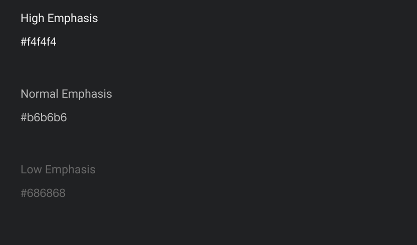
Just like pure black, pure white can equally be just as bad. You never want to have text to large segments with pure white. I like to have 3 levels of white that I can use with a multitude of situations.


Avoid Saturated Colors
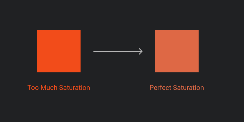
Just as with darks and light colors, you must look at general colors as a whole. Highly saturated colors and large blocks of color can be just as bad. A good way to do this is to switch to HSL (Hue, Saturation, Lightness), and decrease the saturation. Start off by decreasing in increments of 3 or 5, and then fine tune from there. You may also want to increase the lightness if you feel the color is a little on the dark side.

Depth
Depth is all important when it comes to dark mode. In light themes, you can usually convey depth with drop shadows or something like it. Shadows don't work too well in dark mode because ... well, it's dark. You won't see it. Instead you should use your dark background. The darker the color being lower in depth, and the lighter being higher is depth.

Contrast Standards
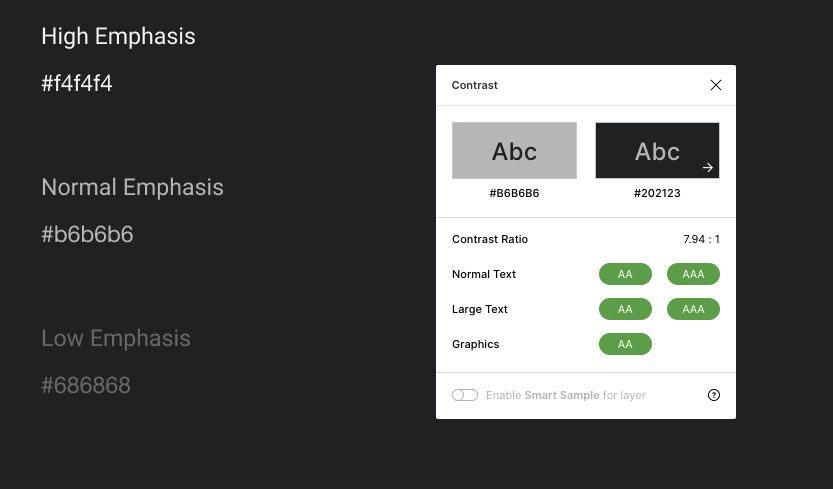
When designing a dark mode design system or webpage/app, it is important to keep things such as accessibility in mind. Chief among them is having enough contrast. This article has gone into a lot of not having too much contrast, but it is just as easy to not have enough contrast making your text hard to read. There are many tools out there to test contrast (such as Alex Carr's Contrast plugin for Figma). What ever the tool you use, make sure your contrast is good enough to read. Do not trust your eyes. Ideally for reading text, you want to pass both AA and AAA standards.

Final Thoughts
These are just the very basic on concepts when designing a dark mode for your project but they are absolutely vital. Having a project in dark mode can look visually great and be highly accessible. Do your research and do your testing to make sure that the choices you can decided on, are the correct ones. It isn't hard, but it does take time.