With our page almost complete, it is time to tackle the last element of our design. The image slider. Normally I would ask people to just mockup the functionality, but we are going to actually make it work because it's just about easier to do it working than fake it working. Let's get started.
What we are Coding
To start off we need to see what exactly we are coding. Here is a screenshot of our content slider.
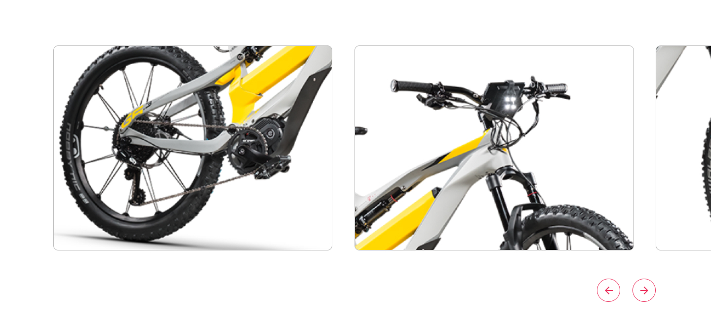
If we pay attention to the design we actually see that the gallery goes off the page. We will have to account for that in our code.
Assets
To get started we need our assets. We have 3 images and 2 icons.
If you are following along here are the exported images.



You'll notice these don't have a border on them like the design. We are going to be applying that with CSS. Even though they appear with a border-radius here, the assets themselves don't. My article style just automatically applies that to any image. We will have to do that with CSS as well.
Now for the icons.
arrow-left.svg
<svg width="47" height="47" fill="none" xmlns="http://www.w3.org/2000/svg"><path fill-rule="evenodd" clip-rule="evenodd" d="M1 23.5C1 35.926 11.074 46 23.5 46S46 35.926 46 23.5 35.926 1 23.5 1 1 11.074 1 23.5zM23.5 0C10.521 0 0 10.521 0 23.5S10.521 47 23.5 47 47 36.479 47 23.5 36.479 0 23.5 0z" fill="#EC3963"/><path d="M32 23H19.83l5.59-5.59L24 16l-8 8 8 8 1.41-1.41L19.83 25H32v-2z" fill="#EC3963"/></svg>
arrow-right.svg
<svg width="47" height="47" fill="none" xmlns="http://www.w3.org/2000/svg"><path fill-rule="evenodd" clip-rule="evenodd" d="M1 23.5C1 35.926 11.074 46 23.5 46S46 35.926 46 23.5 35.926 1 23.5 1 1 11.074 1 23.5zM23.5 0C10.521 0 0 10.521 0 23.5S10.521 47 23.5 47 47 36.479 47 23.5 36.479 0 23.5 0z" fill="#EC3963"/><path d="M16 25h12.17l-5.59 5.59L24 32l8-8-8-8-1.41 1.41L28.17 23H16v2z" fill="#EC3963"/></svg>
Those need to be added to our SVG Sprite. Remember that Grunt handles this for us as long as we save those files in the svg-icons folder.
The Markup
The markup for this will be super simple. Normally we would use an unordered list to code out our gallery, but because of the content slider, we will use, the default is just to use divs. It could be configured to use lists, but we will just keep it simple here.
.gallery
  div
    img(src="/assets/main/articles/code-with-me/part-4/gallery-1.jpg")
  div
    img(src="/assets/main/articles/code-with-me/part-4/gallery-2.jpg")
  div
    img(src="/assets/main/articles/code-with-me/part-4/gallery-3.jpg")

.gallery-nav
  .prev
    +svg('#icon-arrow-left')
  .next
    +svg('#icon-arrow-right')
This needs to go outside our section.container so we are not restrained by its max-width. You can see that we added a folder in our images folder called gallery to house all our gallery images.
The Style
Since we are going to be relying on our javascript to do most of the positioning styling of the gallery, our styles are going to be pretty basic.
.gallery {
  margin-bottom: 50px;

  img {
    border-radius: 10px;
    border: 1px solid var(--gray-light);
  }
}

.gallery-nav {
  display: flex;
  align-items: center;
  justify-content: flex-end;
  max-width: var(--site-width);
  margin: 0 auto;
  padding: 0 20px;

  > div {
    cursor: pointer;
    margin-left: 25px;

    &:last-child {
      margin-right: 0;
    }
  }

  svg {
    width: 47px;
    height: 47px;
    fill: var(--pink);
  }
}
The JavaScript
For our JavaScript, I have chosen to use TinySlider to do all our interactions. In our layout.pug we need to add a reference to it.
script(src="https://cdnjs.cloudflare.com/ajax/libs/tiny-slider/2.9.2/min/tiny-slider.js")
We actually need to make it work now. Going over how this slider works is a little outside the scope of this article, but if you understand basic JavaScript, this shouldn't be anything new. If it is new to you, then just copy and paste this inside app.js.
var slider = tns({
  container: '.gallery',
  items: 1,
  gutter: '45',
  "edgePadding": 100,
  "mouseDrag": true,
  "prevButton": '.prev',
  "nextButton": '.next',
  "navContainer": '.gallery-nav',
  responsive: {
    640: {
      items: 2
    }
  }
});
Since this is a responsive app, we are starting out at only displaying 1 item, and then going up to 2 once it hits 640px in viewport width.
We are Done
With the slider now working that completes the page. I hope you were able to learn something through this 4 part series.