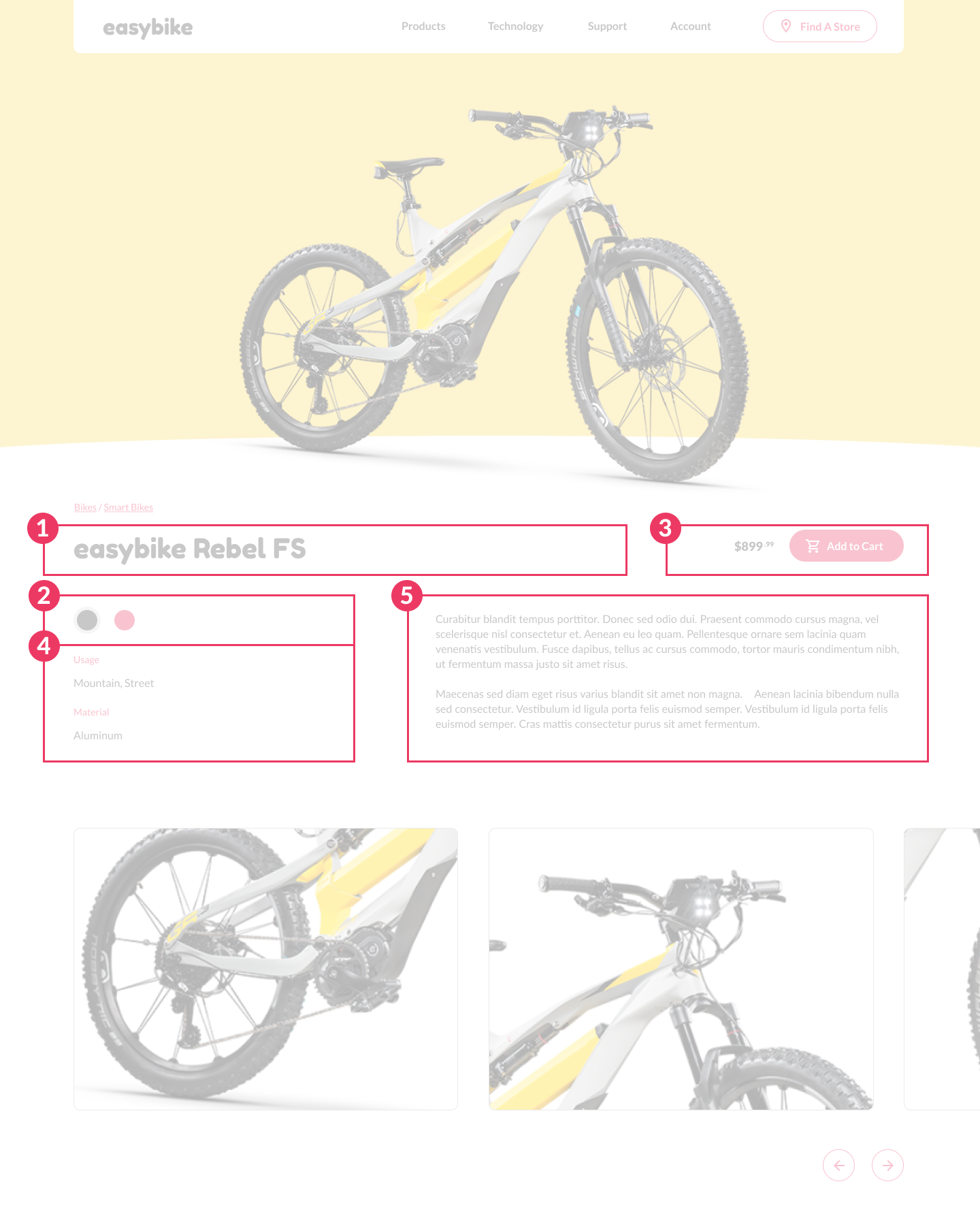
Now that we have the site header done, it is time to dive into the meat of the design. We are going to be using some new techniques in code such as custom form design, CSS Grid, and more. Let's get started.
Breadcrumbs
The first thing we are going to work on is the breadcrumbs. These are actually pretty easy. If we look at it in simple elements it is basically just a series of links. But we need to treat it correctly in terms of markup. You see if we go back to my article about semantic markup, we just can't use a paragraph of links. This is official navigation that needs to be semantic. This not only helps search engines travel your website, but it helps those with screen readers know that it is how they should travel the website. Let's get to the markup. Again, this site uses Pug which gets converted to standard HTML.
Inside out index.pug and inside our .content div we need to write this:
nav.breadcrumbs
  ul
    li
      a(href="#0") Bikes
      span.divider /
    li
      a(href="#0") Smart Bikes
We have a nav tag and inside we have a list of pages. We also have a non-linked element that we want to target for styling. This is the divider between the elements. There are several ways to introduce this divider (like using pseudo content such as ::after) but for sake of clearly understanding what is going on, we will leave it simple. Now let's style it. We are going to put this in our layout.scss file.
/* Breadcrumbs */

.breadcrumbs {
  margin-bottom: 28px;

  ul {
    display: flex;
  }

  li {
    color: var(--pink);
    @include rem-size(14px);
  }

  .divider {
    display: inline-block;
    margin: 0 5px;
  }
}
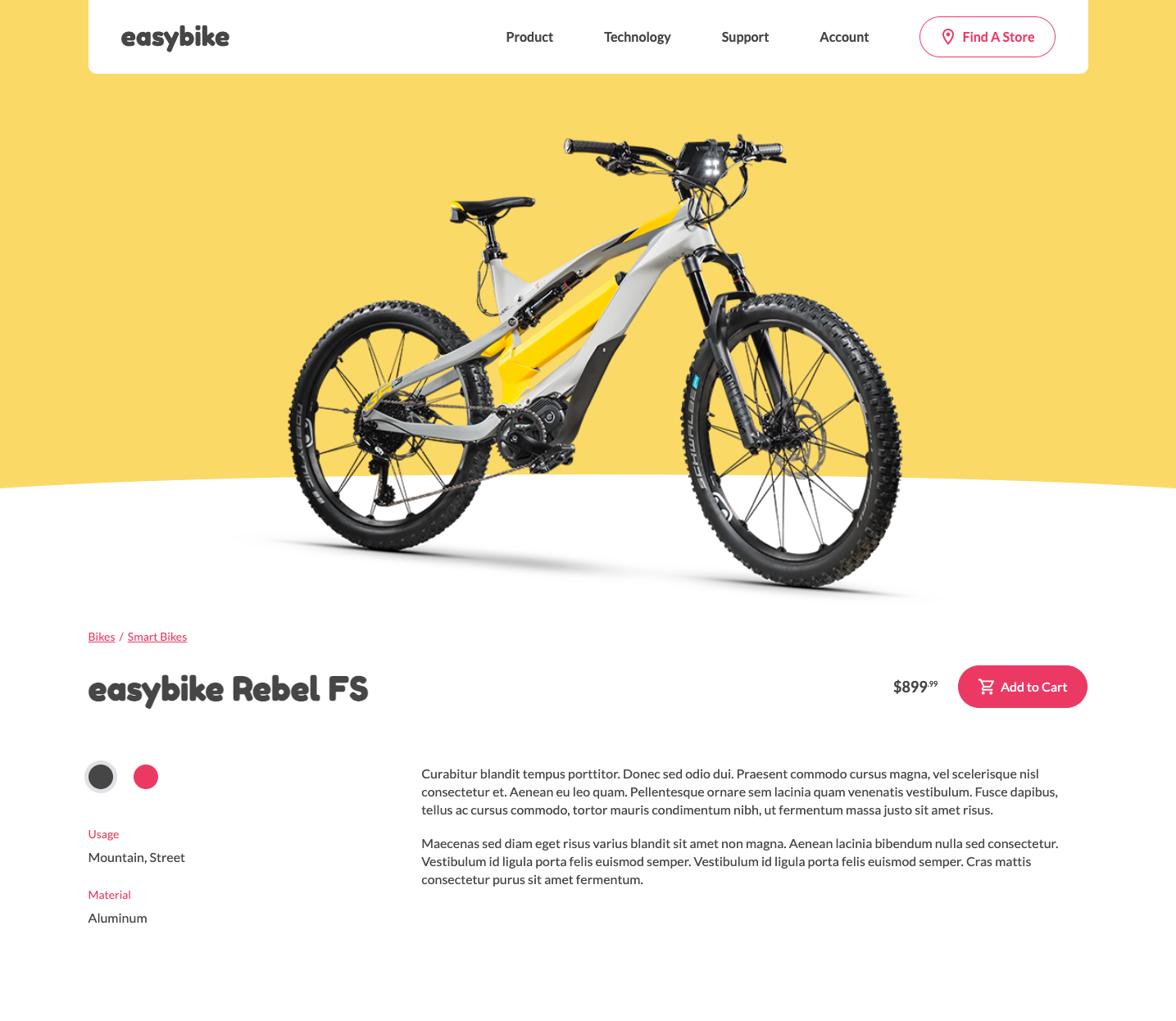
Now this should be perfectly styled the way the mockup looks.

The Content
The Markup
Since this is a mobile app first, let's start with the markup the way it should be.
.product
  .product-name
    h1 easybike Rebel FS

  .product-color
    .radio
      input(type="radio", checked="checked", name="productColor")#productColorGray
      label(for="productColorGray", style="background-color: var(--gray);")
    .radio
      input(type="radio", name="productColor")#productColorPink
      label(for="productColorPink", style="background-color: var(--pink);")

  .product-price
    p.price $899
      sup .99
    p.add-to-cart
      a(href="#0").button.secondary
        +svg('#icon-cart')
        | Add to Cart

  .product-info
    ul
      li
        h6 Usage
        p Mountain, Street
      li
        h6 Material
        p Aluminum

  .product-description
    p Curabitur blandit tempus porttitor. Donec sed odio dui. Praesent commodo cursus magna, vel scelerisque nisl consectetur et. Aenean eu leo quam. Pellentesque ornare sem lacinia quam venenatis vestibulum. Fusce dapibus, tellus ac cursus commodo, tortor mauris condimentum nibh, ut fermentum massa justo sit amet risus.

    p Maecenas sed diam eget risus varius blandit sit amet non magna. Aenean lacinia bibendum nulla sed consectetur. Vestibulum id ligula porta felis euismod semper. Vestibulum id ligula porta felis euismod semper. Cras mattis consectetur purus sit amet fermentum.
What we have is actually pretty basic. The only thing here that is a little weird is the inputs for the product color picker. We are adding a background color and putting them in special containers called .radio which we will style soon.
Before we get to the actual layout, let us style what we can style without dealing with the layout.
Secondary Button
We have another style of button. It has the same style of our other button but with color changes. in our buttons.scss let's add the following code
.button, button.button {
  /* Previous Code */

  &.secondary {
    background: var(--pink);
    color: var(--white);

    svg {
      fill: var(--white);
    }

    &:hover {
      background: var(--white);
      color: var(--pink);

      svg {
        fill: var(--pink);
      }
    }
  }
}
We also need to add the cart icon to our svg sprite.
cart.svg
<svg width="21" height="20" viewBox="0 0 21 20" fill="none" xmlns="http://www.w3.org/2000/svg">
<path d="M14.55 11C15.3 11 15.96 10.59 16.3 9.97L19.88 3.48C19.9643 3.32843 20.0075 3.15747 20.0054 2.98406C20.0034 2.81064 19.956 2.64077 19.8681 2.49126C19.7803 2.34175 19.6549 2.21778 19.5043 2.13162C19.3538 2.04545 19.1834 2.00009 19.01 2H4.21L3.27 0H0V2H2L5.6 9.59L4.25 12.03C3.52 13.37 4.48 15 6 15H18V13H6L7.1 11H14.55ZM5.16 4H17.31L14.55 9H7.53L5.16 4ZM6 16C4.9 16 4.01 16.9 4.01 18C4.01 19.1 4.9 20 6 20C7.1 20 8 19.1 8 18C8 16.9 7.1 16 6 16ZM16 16C14.9 16 14.01 16.9 14.01 18C14.01 19.1 14.9 20 16 20C17.1 20 18 19.1 18 18C18 16.9 17.1 16 16 16Z" fill="white"/>
</svg>
Text Header Styles
Next up we need to add our text style for our headers. We are actually going to create a new file called _product.scss in our modules folder and add the following code. Don't forget to add a reference to this to the style.scss file.
/*
-----------------------------------------
PRODUCT
-----------------------------------------
*/

.product {
  margin-bottom: 60px;

  h1 {
    text-align: center;
  }

  h6 {
    font-family: var(--standard-font);
    color: var(--pink);
    font-weight: normal;
    margin-bottom: 8px;
  }
}
Color Chooser
This is the part that trips up a lot of people, custom styling radio inputs. It is actually quite easy when you learn how to do it. First, let's look at the structure of the markup.
.product-color
  .radio
    input(type="radio", checked="checked", name="productColor")#productColorGray
    label(for="productColorGray", style="background-color: var(--gray);")
  .radio
    input(type="radio", name="productColor")#productColorPink
    label(for="productColorPink", style="background-color: var(--pink);")
We have a simple container called .radio with an input followed by a label. They are also linked as a radio group through the name property. We also have individual IDs for each input that is linked through the 'for' property on the label. This makes it when you click on the label, activates the input. We can actually use this linkage to style things the way we want.
In our _forms.scss file we can write the following
/* Custom Inputs */

.radio {
  label {
    width: 30px;
    height: 30px;
    background-color: #fff;
    box-shadow: 0 0 0 0 #E0E1E5;
    @include transition(box-shadow);
    border-radius: 50%;
    cursor: pointer;
  }

  input[type=radio] {
    visibility: hidden;
    position: absolute;
    left: -9999px;

    &:checked + label {
      box-shadow: 0 0 0 5px #E0E1E5;
    }
  }
}
The first thing to take note of is that we are completely hiding visually our input. It is going to be invisible to the users and work behind the scenes. We are also effectively styling the label to mimic the input.
The last thing is to add the checked state by using the element + element selector to add a solid box-shadow to whatever is checked.
Just for kicks, we added an animation to make it a little nicer in the transition.

Our Layout Problem
If we look at the difference between the desktop and mobile versions of the site, we find that if we just did a straight layout of the elements, they aren't in the same order. We could mess with Flexbox orders but that seems like a lot of work. Let me show you what I mean.


Grid to the rescue
To solve our issue we are going to be using CSS grid. And to make things even easier we are going to be using named grid areas.
Basically, we are going to giving names to all of our main sections and then using those sections to it out on our tablet breakpoint. I am mixing in all the general styles that don't need an explanation but pay close attention to the grid area properties.
.product-name {
  grid-area: name;
}

.product-color {
  display: flex;
  align-items: center;
  justify-content: center;
  margin-bottom: 60px;
  grid-area: color;

  .radio {
    margin-right: 25px;

    &:last-child {
      margin-right: 0;
    }
  }
}

.product-price {
  text-align: center;
  margin-bottom: 50px;
  grid-area: price;

  .price {
    font-weight: bold;
    @include rem-size(18px);
  }
}

.product-info {
  margin-bottom: 35px;
  grid-area: info;

  li {
    margin-bottom: 25px;
  }

  li, p {
    &:last-child {
      margin-bottom: 0;
    }
  }
}

.product-description {
  grid-area: desc;
}
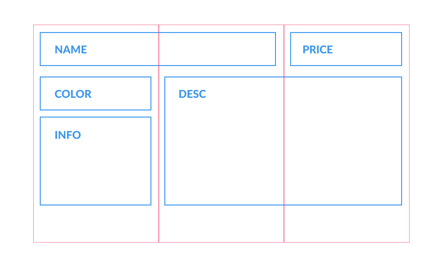
Now as you can see we aren't actually setting the display to grid. This is on purpose because we actually don't need to set it until we need it which is from tablet and larger. Let's do that now and use our fancy names to layout things the way we need.
@include mq('tablet') {
  .product {
    display: grid;
    grid-template-columns: repeat(3, 1fr);
    grid-auto-rows: minmax(auto, auto);
    grid-template-areas:
      "name  name price"
      "color desc desc"
      "info  desc desc";

    h1 {
      text-align: left;
    }
  }

  .product-price {
    display: flex;
    justify-content: flex-end;
    align-items: center;

    p {
      margin-right: 25px;

      &:last-child {
        margin-right: 0;
      }
    }
  }

  .product-color {
    justify-content: flex-start;
    margin-bottom: 35px;
  }
}
What we are doing here with grid is making a 3 column layout and placing our grid areas on that grid. If you are having trouble visualizing how this is working use the following graphic to better understand.

Finishing Up
With that, we are done with the main content section of the page excluding the gallery which we will tackle in Part 4.
If you have been following along your site should be looking something like this:

Until next time.