Now that we have our project setup, let's get to the fun stuff. In this article, we are going to be completing the header on the page. We are going to be coding the logo, navigation as well as the hero image section. Let's get to it.
Assets
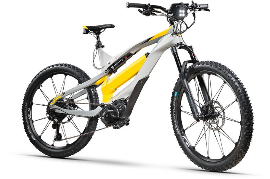
Before we start, we need to make sure that we export out the assets we need. If we look at the design we have 3 total assets; 3 SVG's and one PNG (with transparency).
If you don't want to export it out yourself here are the images of the bike.

For the SVGs we actually need to generate a SVG Sprite. Most of everything is already set up for this (on the GruntJS side). We just need to finish set up so we can actually use it.
In the app/assets/images/ folder create a new folder called svg-icons. In this folder GruntJS is automatically looking for SVG files to compress and create an SVG sprite from. Just save the following SVGs into that folder. If it doesn't generate one, just run the command grunt svgstore.
menu.svg
<svg width="40" height="26" viewBox="0 0 40 26" fill="none" xmlns="http://www.w3.org/2000/svg">
<path d="M2.22222 26H37.7778C39 26 40 25.025 40 23.8333C40 22.6417 39 21.6667 37.7778 21.6667H2.22222C1 21.6667 0 22.6417 0 23.8333C0 25.025 1 26 2.22222 26ZM2.22222 15.1667H37.7778C39 15.1667 40 14.1917 40 13C40 11.8083 39 10.8333 37.7778 10.8333H2.22222C1 10.8333 0 11.8083 0 13C0 14.1917 1 15.1667 2.22222 15.1667ZM0 2.16667C0 3.35833 1 4.33333 2.22222 4.33333H37.7778C39 4.33333 40 3.35833 40 2.16667C40 0.975 39 0 37.7778 0H2.22222C1 0 0 0.975 0 2.16667Z" fill="#464646"/>
</svg>
location.svg
<svg width="14" height="20" viewBox="0 0 14 20" fill="none" xmlns="http://www.w3.org/2000/svg">
<path d="M7 0C3.13 0 0 3.13 0 7C0 12.25 7 20 7 20C7 20 14 12.25 14 7C14 3.13 10.87 0 7 0ZM2 7C2 4.24 4.24 2 7 2C9.76 2 12 4.24 12 7C12 9.88 9.12 14.19 7 16.88C4.92 14.21 2 9.85 2 7Z" fill="#EC3963"/>
<path d="M7 9.5C8.38071 9.5 9.5 8.38071 9.5 7C9.5 5.61929 8.38071 4.5 7 4.5C5.61929 4.5 4.5 5.61929 4.5 7C4.5 8.38071 5.61929 9.5 7 9.5Z" fill="#EC3963"/>
</svg>
We also need to include the sprite in the project. In our layout.pug we edited from the last article, enter the following code below the body opening tag.
include ../../../build/assets/images/svg-sprite.svg
The last thing we need to deal with on the assets is the SVG for the curve. We are going to take the performant way to embed this on the page as inline SVG.
This brings us to the next step...
The Markup
Since we are going to just be dealing with the header here, all of our markup will be contained in the app/views/partials/header.pug file.
This is going to be our new file.
header.site-header.container
  .content

    .nav-header
      .logo easybike
      nav
        +svg("#icon-menu", 'mobile-nav-icon')
        ul
          li
            a(href="#0") Product
          li
            a(href="#0") Technology
          li
            a(href="#0") Support
          li
            a(href="#0") Account
          li
            a(href="#0").button
              +svg('#icon-location')
              | Find A Store

    .header-content
      img(src="/assets/main/articles/code-with-me/part-2/header-bike.png").header-image
  .header-curve
    svg(viewBox='0 0 1440 17' fill='none' xmlns='http://www.w3.org/2000/svg')
      path(fill-rule='evenodd' clip-rule='evenodd' d='M1440 17H0C141.213 6.85567 410.73 0 720 0C1029.27 0 1298.79 6.85567 1440 17Z' fill='white')
    .offset
Notice that we have the SVG code for the curve. It is important to note that we do not specify height and width. We will do this with CSS.
Now if you are not used to PugJS code this might look a little confusing, But the gist of it is you create elements with CSS selectors, and indents are used for children elements. For example, if we code something like
p
  a(href="#0") My Link
Then the export would be:
<p>
  <a href="#0">My Link</a>
</p>
Another thing to point out is a custom PugJS Mixin where it is easier to set svg sprite. Basically, it's a little PugJS code that inserts the code necessary to display a part of a SVG Sprite. I will make an article on just this in the future. The mixin takes two arguments, the SVG ID, and a class to assign to it.
For example, in this case
+svg("#icon-menu", 'mobile-nav-icon')
will export to:
<svg class="mobile-nav-icon">
  <use xlink:href="#icon-menu"></use>
</svg>
So in our whole code above, it will export out to:
<header class="site-header container">
  <div class="content">
    <div class="nav-header">
      <div class="logo">easybike</div>
      <nav>
        <svg class="mobile-nav-icon">
          <use xlink:href="#icon-menu"></use>
        </svg>
        <ul>
          <li><a href="#0">Product </a></li>
          <li><a href="#0">Technology </a></li>
          <li><a href="#0">Support</a></li>
          <li><a href="#0">Account </a></li>
          <li><a class="button" href="#0">
              <svg>
                <use xlink:href="#icon-location"></use>
              </svg>Find A Store </a></li>
        </ul>
      </nav>
    </div>
    <div class="header-content"><img class="header-image" src="/assets/main/articles/code-with-me/part-2/header-bike.png"></div>
  </div>
  <div class="header-curve">
    <svg viewBox="0 0 1440 17" fill="none" xmlns="http://www.w3.org/2000/svg">
      <path fill-rule="evenodd" clip-rule="evenodd" d="M1440 17H0C141.213 6.85567 410.73 0 720 0C1029.27 0 1298.79 6.85567 1440 17Z" fill="white"></path>
    </svg>
    <div class="offset"></div>
  </div>
</header>
If you are still getting used to PugJS, look it over to make sure you understand how it works.
The Style
We have our assets and our markup. Let's get to styling. Let's deal with the container first. We are going to be editing app/assets/scss/includes/modules/_masthead.scss unless otherwise noted.
.site-header {
  background: var(--yellow);
  position: relative;
}
Basically, we are just setting the background color and making sure that if we need to absolute position anything based on this container (hint: we will), then we can do that.
Navigation Bar
Let's start our Navbar.
.nav-header {
  background: var(--white);
  padding: 20px 40px;
  border-radius: 0 0 10px 10px;
  display: flex;
  align-items: center;
}
Very simple we need to set a white background with a border-radius just on the bottom, add some padding. Since we are going to have 2 main elements in this header (logo and menu) we need to make sure they are flex children by setting the .nav-header to display: flex;. We also want these elements to be horizontally aligned so we set align-items: center;.
Because we are coding from a mobile-first perspective, let's code the mobile menu icon.
.mobile-nav-icon {
  fill: var(--gray);
  width: 40px;
  height: 26px;
  @include transition();
  cursor: pointer;
  display: block;

  @include mq('tablet-wide') {
    display: none;
  }

  &:hover {
    fill: var(--pink);
  }
}
We set the fill to a gray (background will not work since it is an SVG), set a height and wide. Set a default animation (using a custom SCSS mixin). We are not using a hyperlink so we need to set the cursor to show the link hand. I also created another SCSS mixin that will handle our media queries automatically. The icon will display by default, and once it reaches a certain breakpoint (set as tablet-wide or 850px) it will disappear. See the _variables.scss file to see where this is specified.
Let's take care of the actual menu.
.nav-header {
  // Previously written code
  ...

  nav {
    margin-left: auto;
  }

  ul {
    display: none;

    @include mq('tablet-wide') {
      display: flex;
    }
  }

  li {
    margin-right: 30px;
    display: flex;
    align-items: center;
    @include transition();

    &:last-child {
      margin-right: 0;
    }

    @include mq('desktop-small') {
      margin-right: 62px;
    }
  }

  a {
    text-decoration: none;
    font-weight: bold;

    &:not(.button) {
      color: var(--gray);

      &:hover {
        color: var(--pink);
      }
    }
  }
}
We want the navigation to be all the way to the right so since it is a flex child, we can set the left margin to auto to push it all the way where we need it. We also make the list items flex children and display them all inline. We do this the same way we did the nav-header. Opposite to the nav icon, we want to make sure that the list is hidden by default, but show when it hits the same breakpoint that the nav icon gets hidden.
With the actual styling of the links, all of them are the same except for the last which we have specified with a class of button. We need to make sure that some of these styles don't overwrite the styles we are going to set for our button defaults. We use the CSS selector :not to make sure that it is styled correctly.
The Logo
Let's get this logo right. It's very simple since it is just text so we just need some basic typography and it will be done.
.logo {
  font-family: var(--header-font);
  font-size: 32px;
}
Buttons
Let's finish up the nav header with the button styles. Since these are global styles we are going to be working in app/assets/scss/includes/base-styles/_button.scss.
.button, button.button {
  cursor: pointer;
  display: inline-block;
  border: none;
  -webkit-appearance: none;
  background: none;
  border: 1px solid var(--pink);
  color: var(--pink);
  padding: 14px 24px;
  border-radius: 50px;
  display: flex;
  align-items: center;

  &:hover {
    background: var(--pink);
    color: var(--white);

    svg {
      fill: var(--white);
    }
  }

  svg {
    max-width: 20px;
    max-height: 20px;
    margin-right: 7px;
    fill: var(--pink);
    @include transition();
  }
}
A lot of these are basic styles for setting up a button but I will point out that we have also set up base styles for any SVG icons that are in the button.
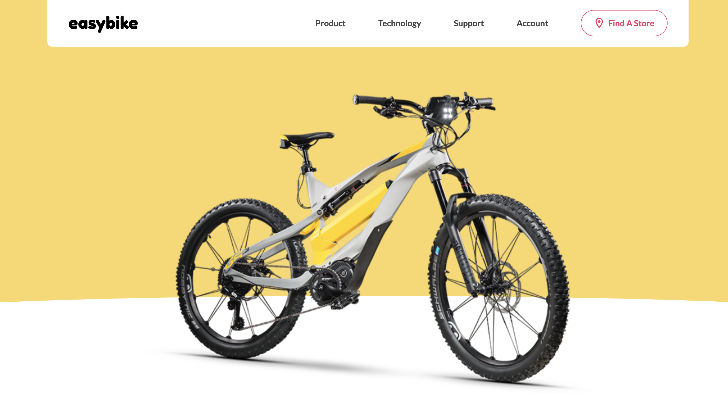
We now have a complete Nav Header which should look like this:

Header Content
Next to the content of the header. This contains the image of the bike as well as the curve. The hard thing with this is that the curve goes partially behind the bike. Let's do the style for the container and bike image.
.header-content {
  padding: 5vw 0 0 0;
  position: relative;
  z-index: 2;

  img {
    display: block;
    margin: 0 auto;
  }
}
Nothing too complex here but I do add top padding of 5vw (viewport width) so as the screen scales so does the space on top of the container. This makes it so we don't have to adjust this by hand depending on the viewport width. We also set the z-index to 2 to make sure it sits above the SVG curve. Speaking of which.
.header-curve {
  position: absolute;
  bottom: 0;
  left: 0;
  right: 0;

  svg {
    width: 100%;
    display: block;
  }

  .offset {
    width: 100%;
    background: var(--white);
    height: 10vw;
  }
}
The SVG is absolute positioned. There is an extra element here called offset which allows us to control how much space is under the curve without it being a part of the curve. This is mostly for flexibility down the line if we need to adjust something so we don't need to edit the SVG directly.
Finishing Up
With that, our header should be complete and look like this:

In the next article, we will be tackling the contents of the page including the breadcrumbs, add to cart buttons, and color selection. Until then.