As I was trying to figure out a new subject to write about it occurred that very seldom does someone go through a project from start to finish unless it is in a video series. Articles are good at going through bits of information, but rarely does it go through the entire process from start to finish. This series hopes to do just that.
Now, there are many ways to build a site. I am not saying mine is the best. But it is the best for me. I have been developing the front end of web pages for over 15 years. My process works for me. It may not work for someone else. Some may find my methods either too advanced or not advanced enough. That is perfectly fine. Everyone is different in the way they have done their process. If it works for them, then it is the best for them. This is my way.
This assumes you know how to work with the CLI, and basic HTML/CSS as well as working with SCSS.
What are we building?
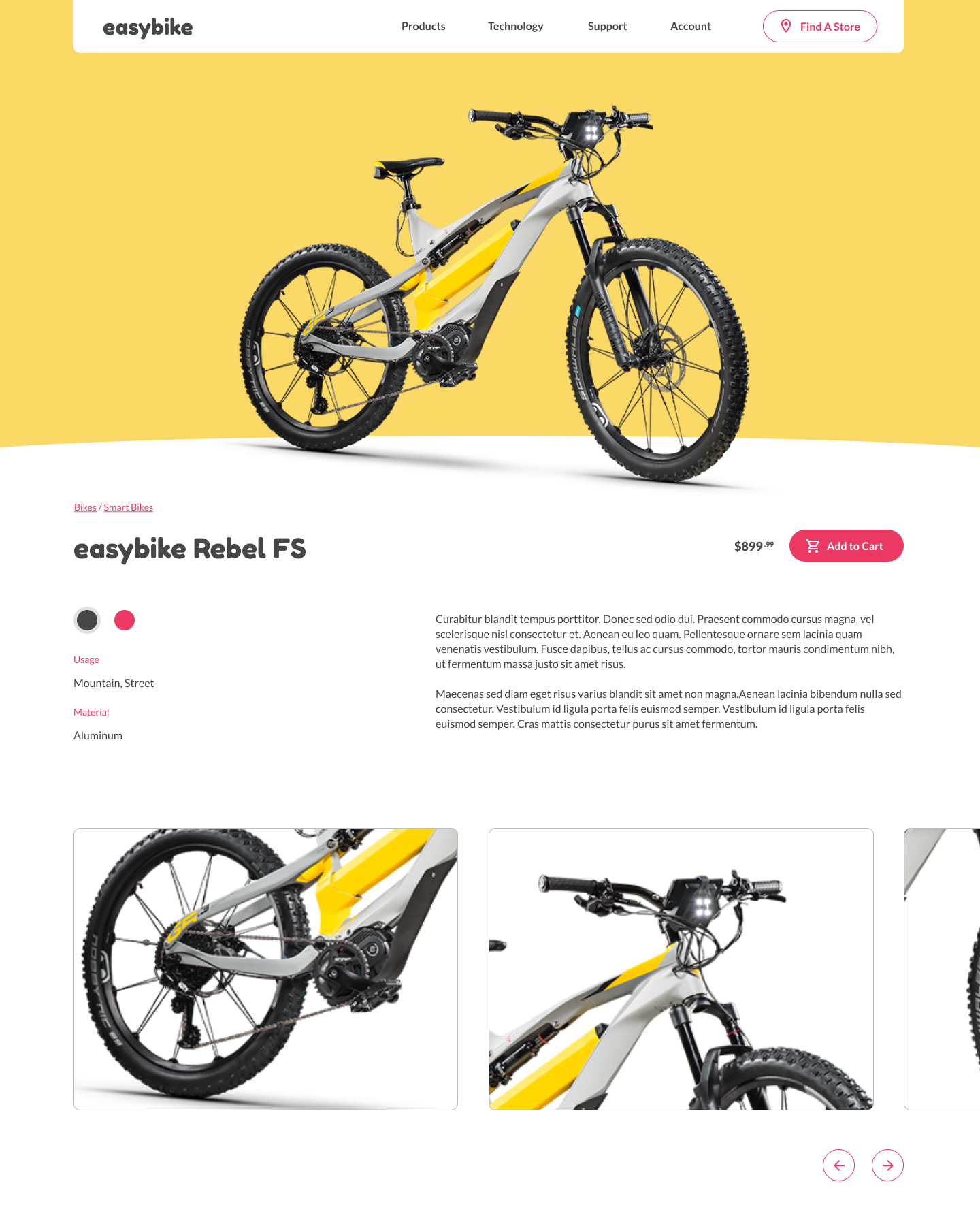
At my current full-time job I designed something loosely based on a design I saw on Dribbble. I have given this out for people to code and so far no one has done it. That is actually a good thing. It isn't a hard design to code out, but it does weed out those who pretend to code with Bootstrap. The design is fairly simple but there are some tricky parts that are designed to trip up a beginner. That is its purpose. As we go through this design over several parts, I will explain my decision for coding it the way I do.
The Design
You can see my Figma file at https://www.figma.com/file/mpeQ9M1uFG0BGzbN20BGQX/Coding-Challenge?node-id=0%3A1


This will be a mobile first codebase, so we will go from small to large.
Getting Started
First thing first. Let us get our coding environment up and running. I will be using my Starting Project found here: https://github.com/cibgraphics/project-starter. Please follow the readme file with installing NPM and the GruntJS CLI. I will not be going over setting that up in this series of tutorials. I also have a starter GruntJS article found here: https://www.cibgraphics.com/articles/grunt-js-basics-part-1 if you wish to learn more about GruntJS.
For our purposes here, everything should be set up for you file-wise. After you place the contents of the repo in a folder and navigate to it via the command line, please run a npm install to install all the Grunt Modules.
Run grunt to start the GruntJS process.
Project Setup
Colors
My starter files assume that we are going to be using SCSS variables. In this project, we aren't going to worry about backward support so we are going to use CSS Custom Properties instead.
In app/assets/scss/includes/base-styles create a new file called _colors.scss. We will also have to add a call to it in our styles.scss (found in app/assets/scss/style.scss).
In here we are going to add all the colors we are going to need. Just copy and paste this in _colors.scss
:root {
  // Colors
  --yellow: #FAD966;
  --gray: #464646;
  --pink: #EC3963;
  --gray-light: #E0E1E5;

  --white: #fff;


  // Normalize Common Colors
  --text-color: var(--gray);
}
Fonts
Let's take care of the fonts that we are going to be using. Thankfully they can be found on Google Fonts. The fonts we are going to be using are called Fredoka One and Lato.
Pug?
To do this next part we are going to be writing some PugJS. Don't worry, it is really easy and much quicker than doing raw HTML.
In app/views/layouts/layout.pug you can see the base skeleton of a webpage, but almost written like CSS Selectors. Enter this Google Font code where it should.
link(href='https://fonts.googleapis.com/css2?family=Fredoka+One&family=Lato:ital,wght@0,400;0,700;1,400;1,700&display=swap' rel='stylesheet')
Variables
Let's edit our app/assets/scss/includes/helpers/_variables.scss so we can stop getting errors in our command line. Since we are switching out a lot of SCSS variables to CSS Custom Properties we will need to touch a lot of files. So make the following edits.
_variables.scss
/*
-----------------------------------------
WIDTHS
-----------------------------------------
*/

:root {
  --site-width: 1220px;
}


/*
-----------------------------------------
SPACING
-----------------------------------------
*/

:root {
  --space:                     20px;
  --space-xxxs:                calc(0.25 * var(--space));
  --space-xxs:                 calc(0.375 * var(--space));
  --space-xs:                  calc(0.5 * var(--space));
  --space-sm:                  calc(0.75 * var(--space));
  --space-md:                  calc(1.25 * var(--space));
  --space-lg:                  calc(1.5 * var(--space));
  --space-xl:                  calc(2 * var(--space));
  --space-xxl:                 calc(2.5 * var(--space));
  --space-xxxl:                calc(3 * var(--space));
}


/*
-----------------------------------------
FONTS
-----------------------------------------
*/

// Font Family
:root {
  --header-font: 'Fredoka One', cursive;
  --standard-font: 'Lato', sans-serif;
}

// Font Size
$font-size:                 16px;


/*
-----------------------------------------
BREAKPOINTS
-----------------------------------------
*/

$breakpoints: (
    "desktop-wide":         1248px,
    "desktop":              1024px,
    "desktop-small":        992px,
    "tablet-wide":          850px,
    "tablet":               768px,
    "tablet-small":         720px,
    "phone-wide":           600px,
    "phone":                480px,
    "phone-small":          400px
);

@mixin mq($width, $type: min) {
  @if map_has_key($breakpoints, $width) {
    $width: map_get($breakpoints, $width);
    @if $type == max {
      $width: $width - 1px;
    }
    @media only screen and (#{$type}-width: $width) {
      @content;
    }
  }
}
_general.scss
::-moz-selection{
  background: var(--pink);
  color: var(--white);
}
::selection {
  background: var(--pink);
  color: var(--white);
}
html {
  /* Prevents webpage zooming for mobile devices change orientation */
  -webkit-text-size-adjust: 100%;
  -ms-text-size-adjust: 100%;
  font-size: $font-size;
  background: var(--white);
  font-family: var(--standard-font);
}

body {
  background: var(--white);
}
::-webkit-input-placeholder { color: var(--gray-light) }
::-moz-placeholder { color: var(--gray-light) }
:-ms-input-placeholder { color: var(--gray-light) }
input:-moz-placeholder { color: var(--gray-light) }
_forms.scss
label {
  display: block;
  @include rem-size(15px);
  color: var(--text-color);
  margin-bottom: 10px;
  line-height: 1.4em;
}

input, textarea {
  width: 100%;
  border: 1px solid #333;
  padding: 10px;
  @include rem-size(16px);
  color: var(--text-color);
  border-radius: 5px; // For iOS
}
_layout.scss
.container {
  padding: 0 20px;
  background: var(--white);
}

.content {
  max-width: var(--site-width);
  margin: 0 auto;
  position: relative;
}
_typography.scss
/*  Basics */

a {
  color: var(--pink);
  @include transition();
  text-decoration: none;

  &:hover {
    text-decoration: underline
  }
}

p {
  @include rem-size($font-size);
  line-height: 1.4em;
  color: var(--text-color);
  margin-bottom: 1.2em;
}

blockquote {

}

hr {

}


/* Headers */

h1, h2, h3, h4, h5, h6 {
  color: var(--text-color);
  line-height: 1.4em;
}
Ok... that was a lot of fixing. Sorry about that. Kinda the nature of the beast when starting projects.
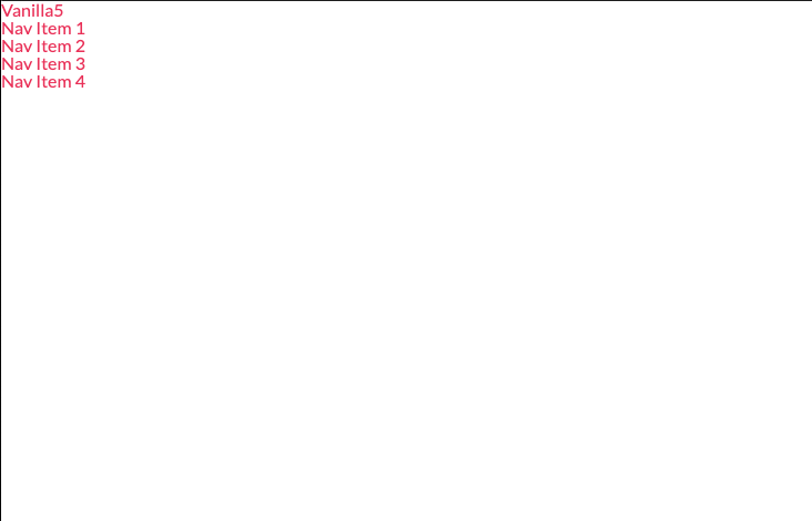
Our page doesn't look very good. In fact, it looks nothing like our design.

You might also be asking why aren't all of our variables in CSS Custom Properties such as the font size. It is because we are running some SCSS processes on it that require it to not be in a custom property.
Prepping for Part 2
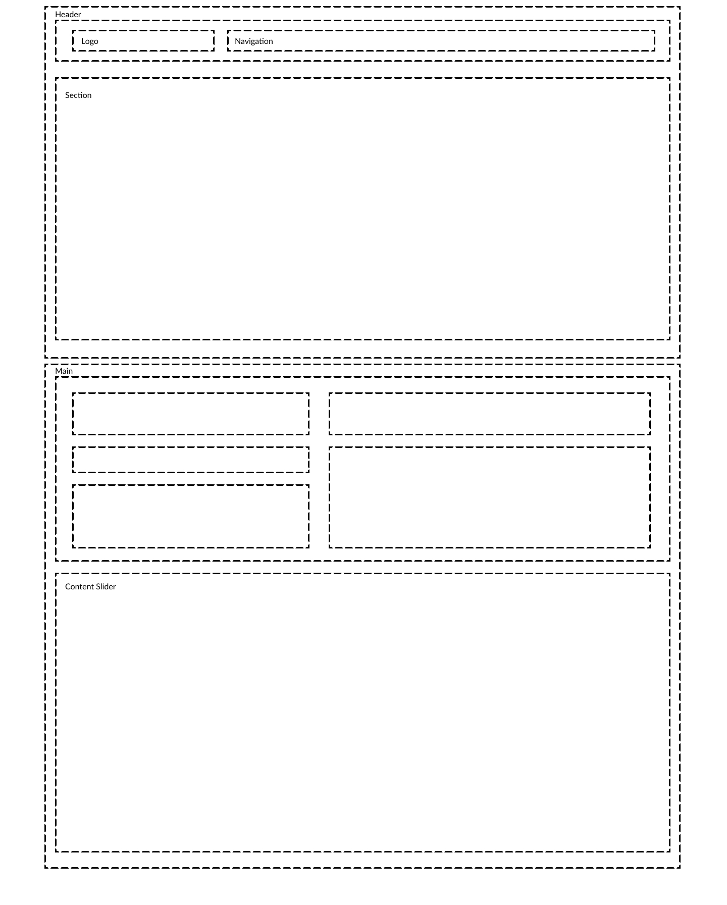
In part 2, we are going to be building the main layout of our page. In order to do that we need to examine how the layout will be built. What will be part of the header, what will be part of the main section, what will be what.
If you want to do this on your own, go ahead and exercise, but this is what I will be building it like

Until Part 2. Farwell.